Floasis
UX - UI DESIGN
The Project
FloAsis is an app that helps busy people find and purchase flowers for themselves or their loved ones, allowing them to schedule a specific delivery date to ensure they never miss a special occasion.
UX-UI Designer
July-August 2023
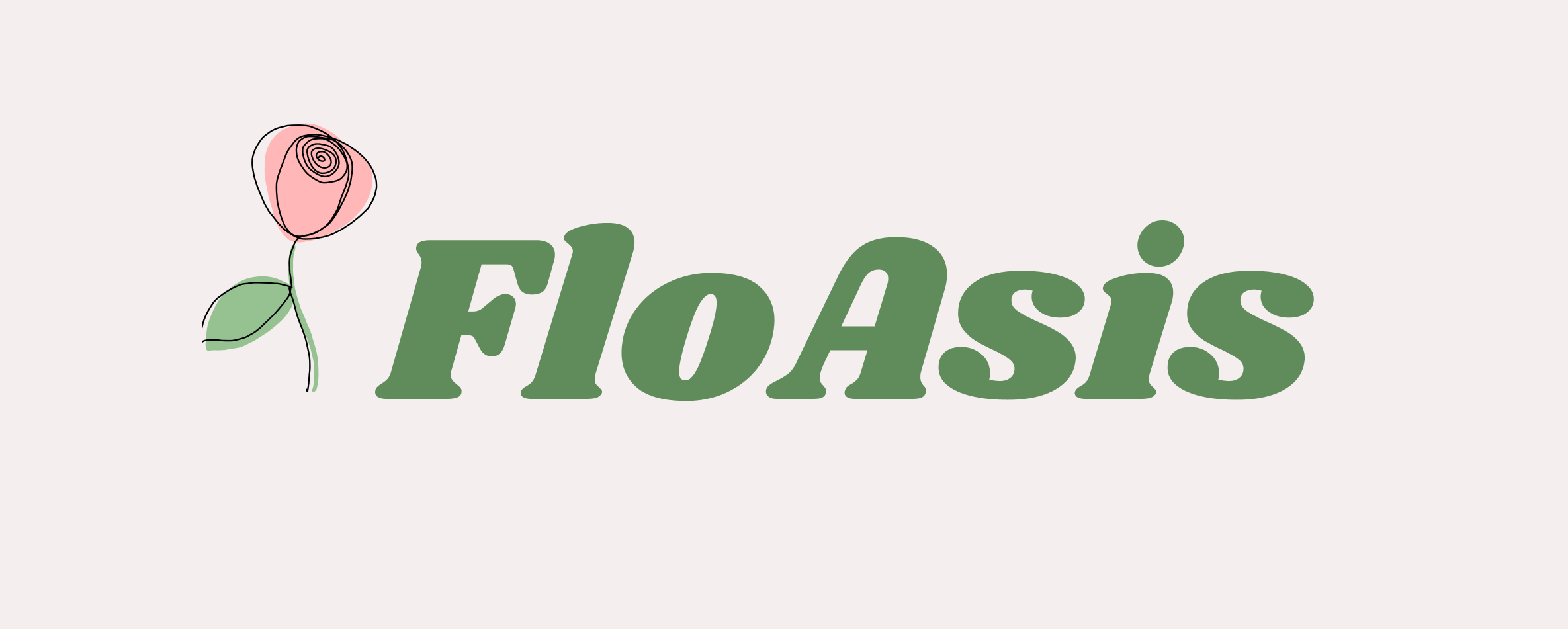
Busy workers lack the time necessary to go to local flower stores.
Design an app to easily browse and purchase flowers, plants and bouquets quickly and easily with the added convenience of scheduling delivery on a specific date.
User research, wireframing, low and high fidelity prototyping, conducting usability studies, accounting for accessibility and iterating on designs.
My Design Process

Understanding the user
User research
I began conducting user research, identifying the user demographic that would benefit from this app and pinpointing the user pain points that have arisen.
A primary user group identified through research was busy adults who don’t have time to go to the local stores to buy flowers as gifts or for themselves.
Pain Points
1.
Time
Busy professionals are too busy to go to local stores to choose and buy flowers.
2.
Delivery scheduling
Users want to make sure their flowers will get to destination on a chosen specific date.
3.
Favourites
Users want to be able to save their favourite products in a separate section of the app for later purchases.
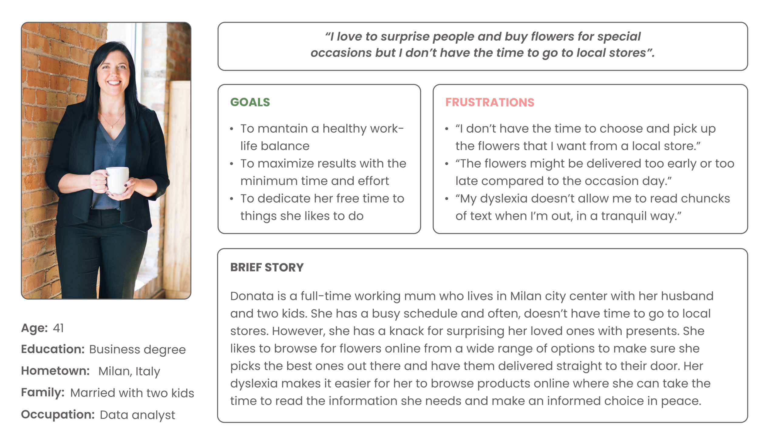
User Persona: Donata
Donata is a busy professional who needs a reliable flowers delivery app to help her making presents for her loved ones on their special day because she doesn’t have the time to go to local stores.
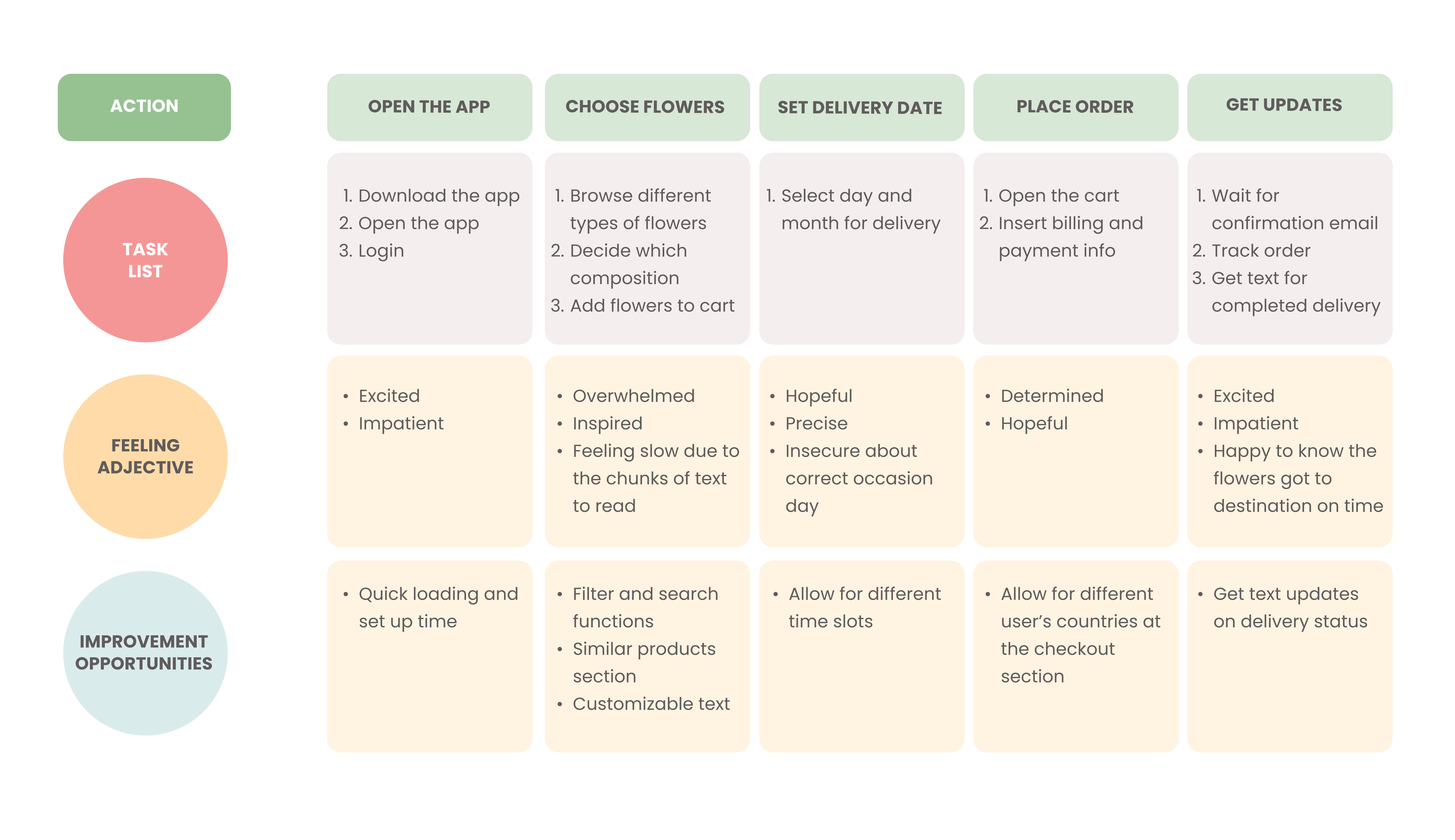
Donata's user journey
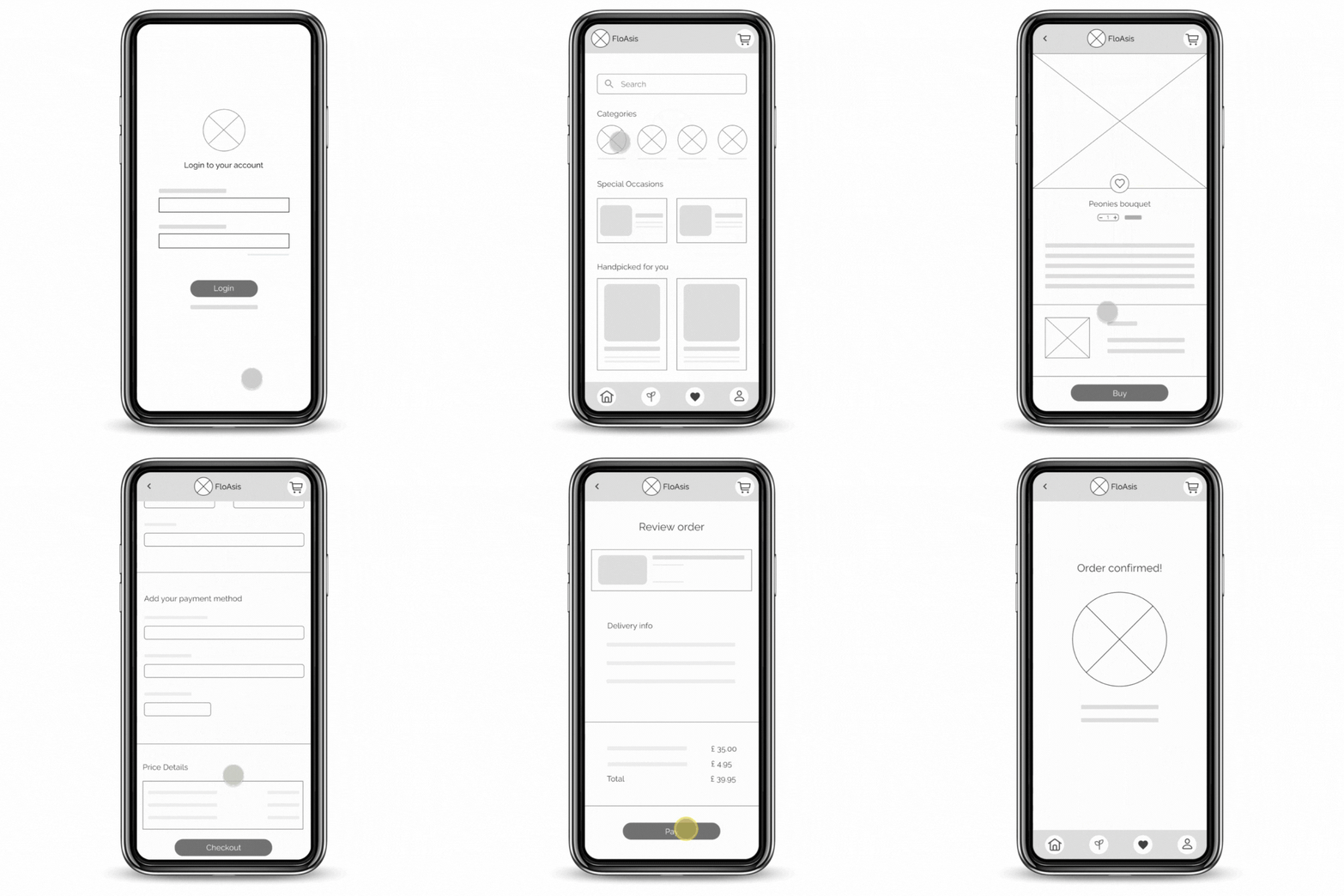
Mapping Donata’s user journey revealed how convenient it is to do everything with one app: purchasing, tracking the order and get a notification message for completed delivery.
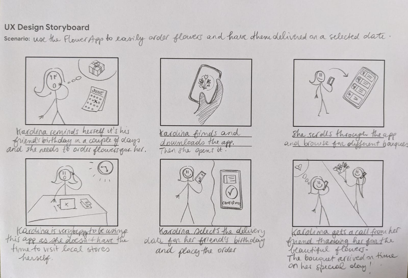
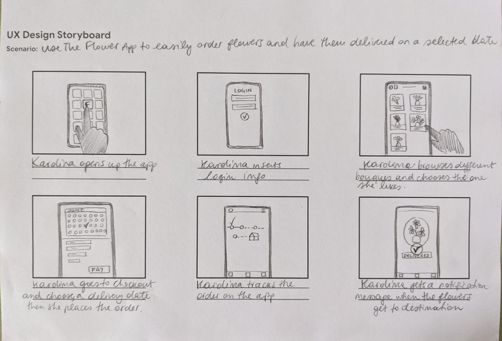
User storyboards
Starting the design
Paper Wireframes
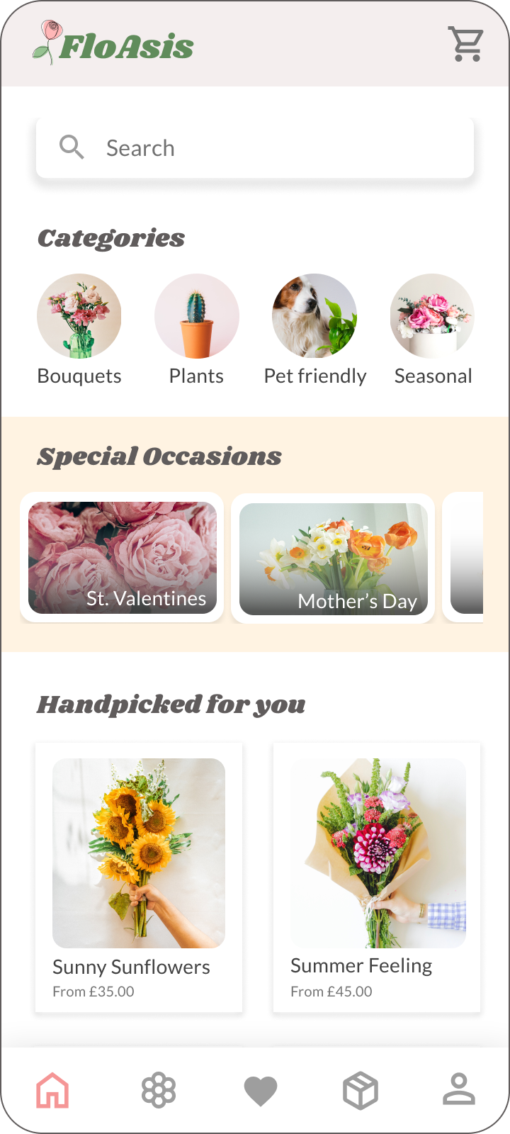
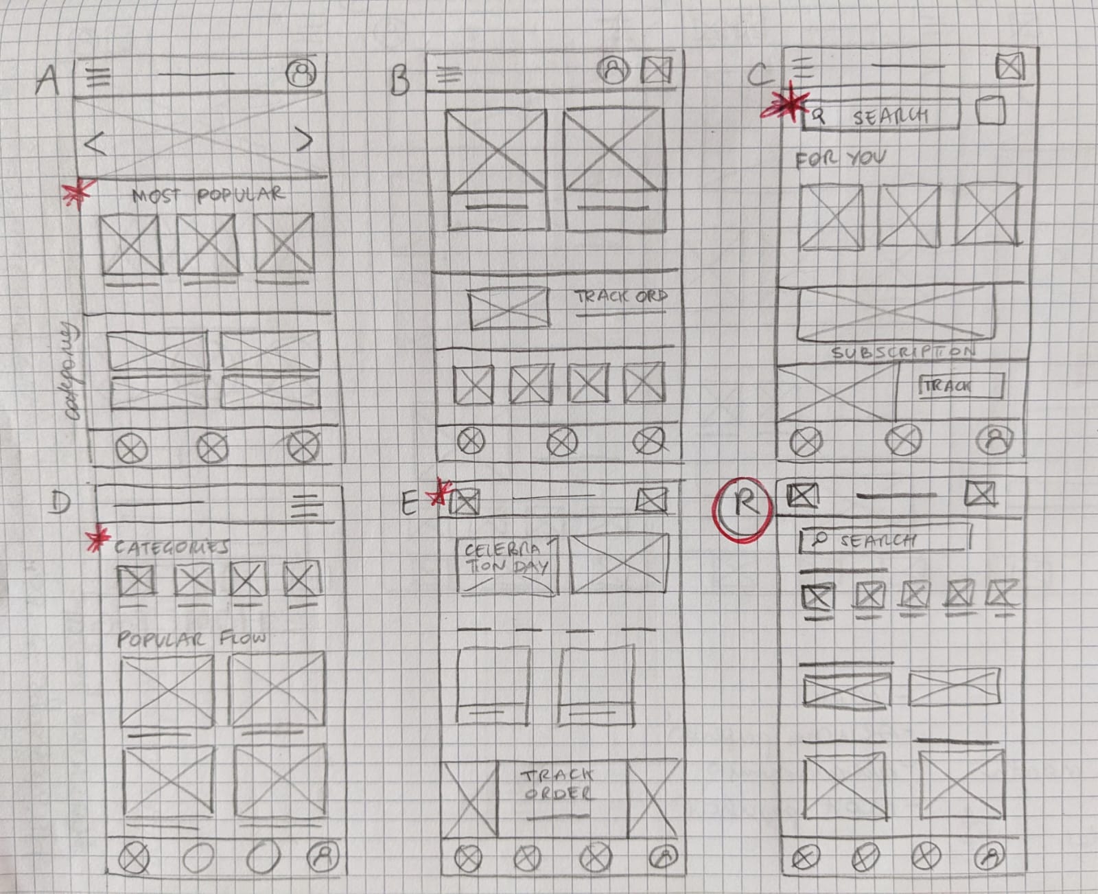
Here are the wireframes for the homepage. I aimed to incorporate sections that would be most useful for our target users, including Categories, a Search bar, Special Occasions, Tracking Orders and Most Popular.
* Stars were used to mark the element of each sketch that would be used in the initial digital wireframe.
Digital Wireframes
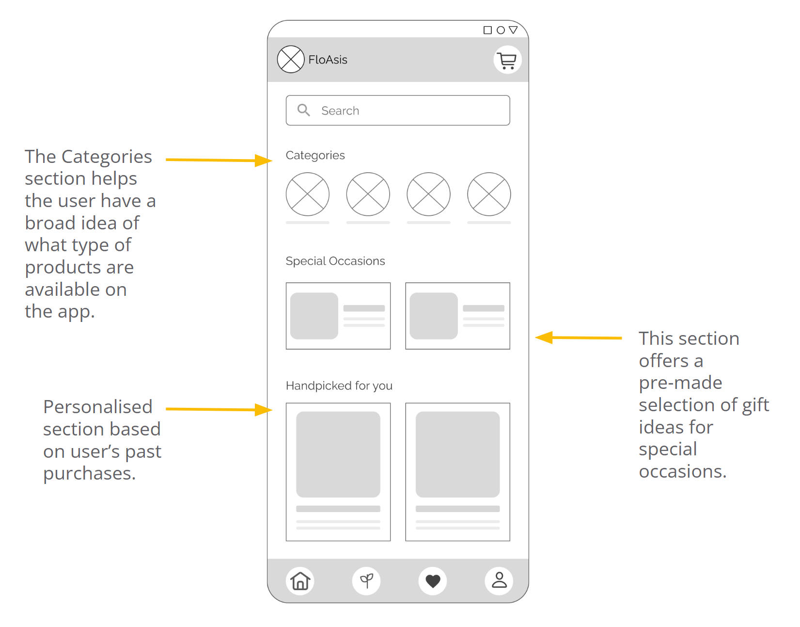
Here is the refined version of the Homepage.
As the initial design phase progressed, I ensured that screen designs were based on user needs and research findings.
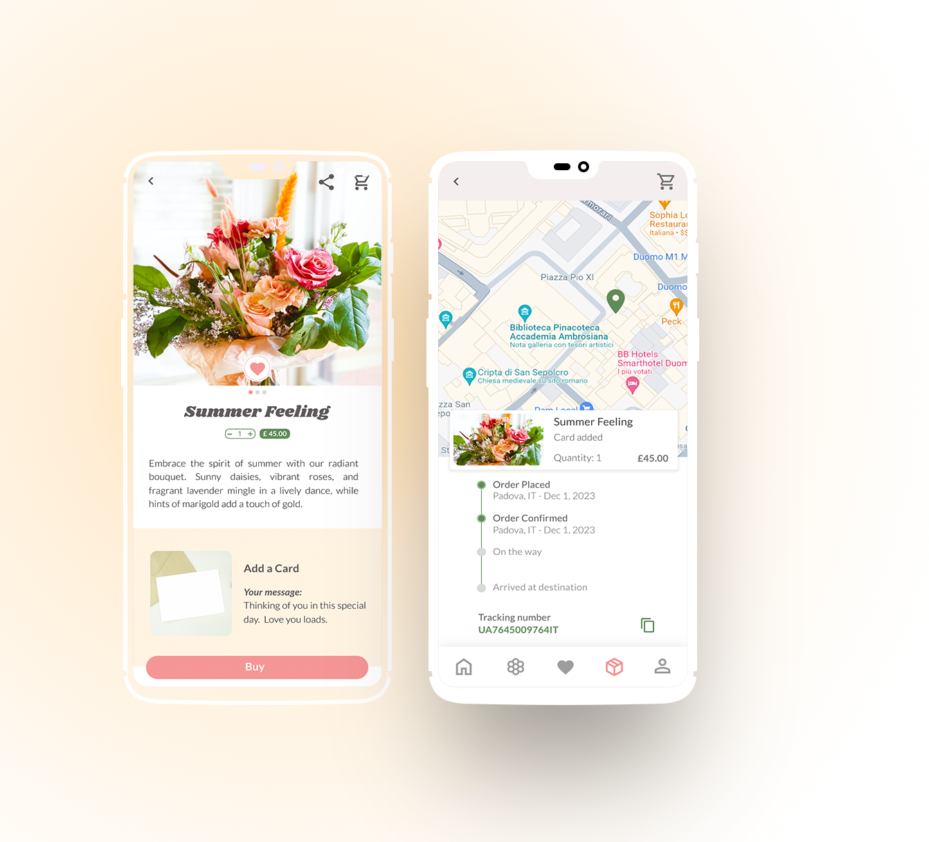
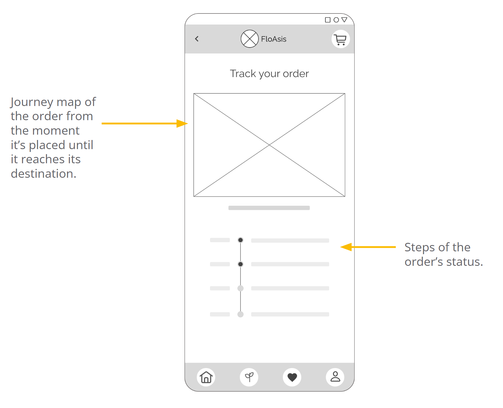
The Tracking Order page allows users to easily monitor the status and progress of their orders.

Usability study
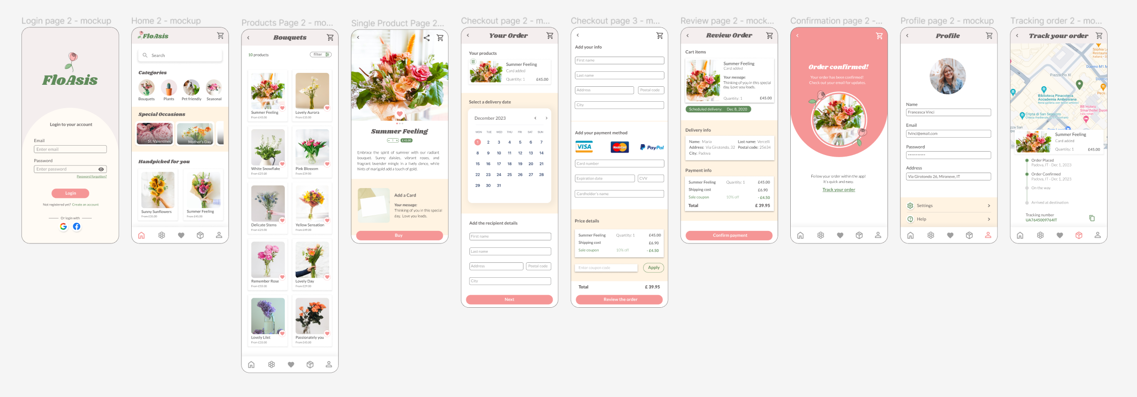
I conducted two rounds of usability studies. Findings from the first study helped guided the designs from wireframes to mockups. The second study used a high fidelity prototype and revealed what aspects of the mockups needed refining.
First round:- Users want to easily find a specific product
- Users want to find the Tracking Order function in an intuitive way
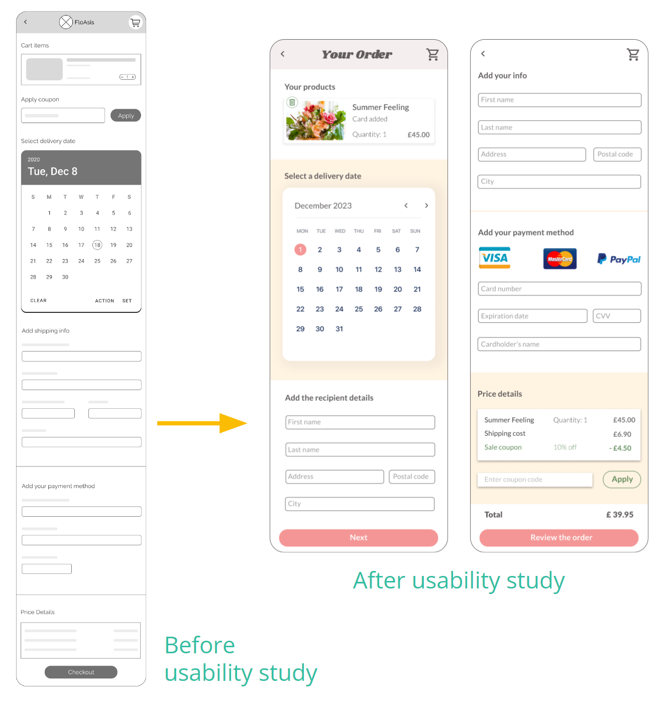
- Users found the checkout page too long
- Users found transitions between screens a bit slow sometimes
Refining the design
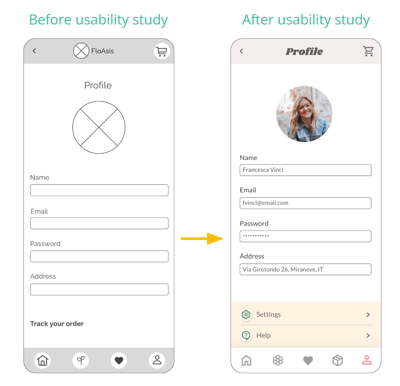
Users found the Tracking Order functionality non intuitive to locate, and they felt it could become obscured within the profile details.
Given its critical importance for the app, I opted to relocate it to the bottom menu bar for effortless and immediate access.
Dividing the checkout process into two distinct screens enhances user clarity during the journey.
